


VetBuddy helps users:
learn about pet care at home
chat with the vet
create reminders and log care
From concept to high fidelity design.
Responsive Website
My role: UX/UI Designer
Duration: Jul - Oct 2022
Tools: Figma, FigJam
Raising a Puppy is Hard
For Christmas 2021 my partner and I got a puppy. It was so fun and awesome but also very difficult; as first time pet owners we often worried about his health and wanted to be sure we were doing as much as possible for the little guy.
I looked for apps or websites to help us know that we were giving him the proper care but wasn’t able to find anything useful.
I realized there was a need for a product to help puppy parents navigate the first year.


What are the users experiencing now? How could it be improved?
Goal: Understand the user’s current experience so I can design in a way that will be useful. Ask really good questions.
Empathize

Before I start creating solutions I need to know if I’m solving the right problem. Here’s what I did to find out:
Competitive Research
User Research
I studied three products that were similar to the one I wanted to create. Pup to Date and Pawprint were focused on tracking pet care; Buddies was focused on shopping for pet products and included a feature to learn about pet care. None of the competitors included both care tracking features as well as a learn function; they were all missing communication with the vet, which I see as an essential part of pet care.
What I learned: there was a need for an all-in-one pet care product that enables the user to learn about pet care at home, communicate with their vet, create reminders and track care.
Competitive Research
User Research
I interviewed a diverse group of people who have raised puppies to learn about their needs, desires, and challenges when it comes to pet care. I organized their responses on sticky notes in FigJam to get a better understanding of the problem to solve.

Key Quotes
“Getting a dog is like having a child. I’m always worried.”
“I like to find info online and figure out the issue myself first.”
“I would like more information from the vet about my pet.”
What I learned: There is a bigger need than just puppy care: lifelong care. Our users need a product that is useful over the course of their pets’ life for things like:
managing care schedules
vet communication
learning about supplemental & at-home care.
Lesson Learned: Sometimes the product I want to make is not the product that is most needed.
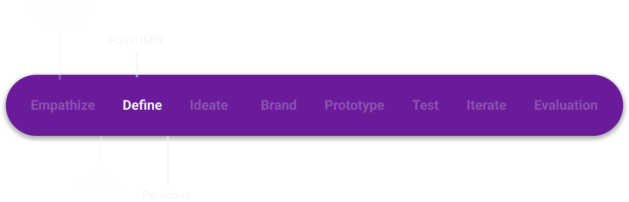
Define
What are the users thinking? What problems can I solve for them?
Goal: Step into the users’ shoes. Minimize my own bias.
Here’s what I did to deepen my thinking:
POV Statements, HMW Questions
User Personas

POV statements and How Might We questions help narrow down the scope of the project and focus on the issues that are most relevant to the users. This helps me empathize with the user and create personas.

Moderately concerned about pet care

Not overly concerned about pet care.

Frequently anxious about pet care.
My personas stay with me as visual reminders to keep the users in focus as I move into brainstorming design solutions.


How many different ideas can I come up with?
Goal: Explore as many solutions as possible.
Ideate
Here’s what I did to brainstorm:
Divergent Thinking
Storyboarding
User, Business, Tech Considerations
Sitemap
User/Task Flows
Wireframing
Divergent Thinking allowed for creative problem solving.

Storyboarding constructed an ideal narrative for the user’s experience.

Considerations focused the scope of the project and helped me be aware of any limitations.


Sitemap provided a framework for user/task flows.
Task Flows provided a framework for which screens to wireframe.


Low Fidelity Wireframes were a low-cost way to explore solutions and decide which designs to bring to high fidelity.


Mid Fidelity Wireframes gave an idea of what the final product will look and function. To bring it to life, I needed to add branding.


Brand
How can I help the business distinguish itself and share its message?
Goal: Deeply understand the brand’s goals and identity.
Here’s what I created:
Mood Board
Color Palette
Typography & Logo Design
Style Tile
UI Component Library
Mood Board visualized how the product will make the user feel and kept the vibe of the design consistent.

Color Palette is one of the most memorable aspects of branding; it sends a message to the viewer about the company implicitly.

Options
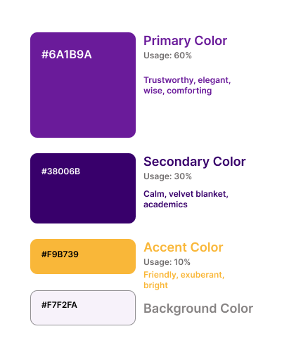
Final Pick
Typeface reflects the tone and style of the brand. The taller x-height and rounded bowls exude openness as well as upright posture, giving VetBuddy a sophisticated yet playful vibe.

Logo reflects the way that VetBuddy “sheds light” on the topic of pet care, always keeping the best interest of our furry friends at the center.


At this point I took every aspect of branding and put it into a style tile.
Style Tile includes my icon library. I used this document to keep my design consistent.


UI Component Library kept my design consistent and saved lots of time.
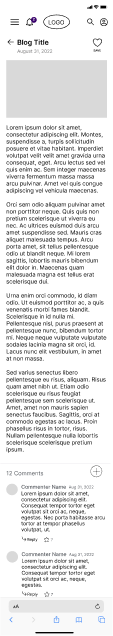
Now I could take my designs from mid to high fidelity.

Prototype
How does this all come together? What are the best design decisions for the users, the business, and the developers?
Goal: Create a MVP to test for usability.
I linked my high fidelity screens together to create a working prototype to conduct accessibility testing.


Test
What do the users think of the design? Does it make sense to other people?
Goal: Stay open to feedback and find out what needs to improve.
I had 5 pet owners click through my prototype to see what I could iterate upon.
Feel free to try it out yourself.

I found that most users had no problem navigating the prototype and gave very positive feedback overall. Even so, they needed an easier way to get to the Learn page from Home.

How can I use my research findings to improve my design?
Goal: Create solutions to any glaring user issues.
Iterate

To decrease clicks for the user and make it easier for them to see more of the information they need, I added a button to quickly get to the Learn page from Home.

Evaluation
How did my solution address the problem?
Goal: Feel satisfied with the work I have done and remain open to future iterations.


Backed by my research, this design solves the problem of improving pet care in an organized and beautiful way. It arms the user with knowledge and provides peace of mind that their pets are receiving the best care possible.
Thank you for your attention!
Interested in working together?
