


USEI Responsive Website Redesign
refresh and modernize the look and feel
help the business grow by attracting customers
convey the professionalism and expertise of the company
From concept to high fidelity design.
My role: Digital Product Designer
Design Team: GoodEye Productions; Grace Klepec, Ian Weiss
Duration: 4 weeks; Feb 2023
Tools: Figma, FigJam
One Benefit of Talking to Strangers
One rainy morning in Seattle, my partner and I were sitting at the big table at our regular coffee shop and getting to know the other people working remotely and sipping their lattes around us. A guy, let’s call him Adam, told us that his company, USEI, was looking to grow but their website wasn’t helping them gain much business.
For one of my UX design capstones I was tasked with redesigning an existing website. I decided to look outside the school’s suggested prompts and try to work with a real company.
My design partner, Ian, and I took a look and agreed that USEI could use some help with a redesign. We decided to take it on as a team to fulfill our third capstone. Working with a real company with real stakeholders is more challenging than making up our own idea for our project and we were up to the task. We went through our rigorous design process together, each contributing to every step; first ideating individually then doing stand-ups to present and defend our ideas and discuss which solution elements to incorporate.
After a deep dive into understanding the satellite telecommunications industry with no background knowledge we successfully applied our data-driven, user-focused design process to create a solution that was received very positively by the stakeholders.
“This has a much more fun and modern look to it, I am excited that the website now has a purpose and matches the caliber of USEI.” - Will
The redesign provides:
At-a-glance information: The new design allows users to quickly learn about USEI without having to dig through multiple pages or menus.
Easy access to technical information: The redesign makes it easier for users to find technical information, which can be especially important for people who need to make informed decisions about USEI's products or services.
Elegant and delightful design: A well-designed website can help build trust and credibility with users, and the redesign prioritizes aesthetics and user experience.
Simple contact options: The new design makes it easy for users to get in touch with USEI, which can be important for customer support, sales inquiries, or other reasons.
Overall, the redesign focuses on improving usability, accessibility, and overall user experience, which will help attract and retain visitors to the site.

Empathize
How are competitors representing their companies? How can we improve USEI’s online presence?
Goal: Understand where USEI stands in relation to their competitors; find out what about their current website is working and what isn’t. Ask really good questions.
Before forming a hypothesis, it’s important to know if we’re fully understanding the challenge. Here’s what we did to deepen our thinking:
Competitive Research
Stakeholder Interviews
Heuristic Evaluation of the Current Website
We researched and analyzed 6 competitors’ websites to learn how they were organizing their information, what was working for them, and what was not. We performed in-depth critiques on each site. Things we liked are in green and design decisions we wanted to avoid are in red.
Competitive Research

SES
Industry Leader
Atlas Space Operations

Direct Competitor
Satcom Direct

Direct Competitor
We found that about half of the sites had pretty poor usability and visual design and the other half had updated UI but the designs felt cluttered and content-dense. With that being said, there were many things we found helpful including patterns in design and information architecture. It was helpful to see how each company differentiated themselves and showed how they relate to the customer.
We created five categories to organize our findings in an affinity map: Do’s, Don’ts, Template Ideas, Homepage, and CTAs. This allowed us to uncover trends and user needs, which helped us understand how to make USEI stand out in their market and gave us a better idea of how to tackle information architecture.

One key finding was the lack of use of CTA’s on competitors' sites; this made the experience confusing and without a clear path. Thus, we decided to focus on 2 main user flows using simple templates with clear CTA’s. This will guide the user to learn about USEI and then contact them, increasing new customers and expanding the business.
Finally, we critiqued USEI’s current design, comparing it to its competitors. The site was overall outdated and difficult to navigate. There were many elements that served no clear purpose and it was difficult as a first time user to understand the structure of the website. That said, the design did have some essential elements and high quality images that you’ll see we included in our redesign.

With the data from our heuristic analysis and the insight gained from the stakeholder meetings, we identified a problem: USEI’S website was outdated and heavy with technical jargon, making it hard to understand at-a-glance what cool stuff USEI does. This created a lack of user engagement and failed to draw in new customers. Armed with knowledge, we moved into defining our hypothesis.
What we learned: USEI and its competitors had websites of similar quality. The industry standard for website usability and delightfulness seemed to be low and we became excited to raise the bar.
Key Quotes
“It’s important to show the weather at the terrestrial satellite stations so that customers can see how the antennas will work without having to call to ask the station.”
“We want the antenna info to be downloadable.
“LEO is our biggest market increase service across the board; some customers only come here for LEO. Coverage is our second biggest.”
We met with a few stakeholders over Zoom to get a better idea of USEI’s and their customers’ needs. We learned a lot about the satellite industry and realized that we would have to learn a great deal more to be fluent enough to redesign the website.
Stakeholder Meetings
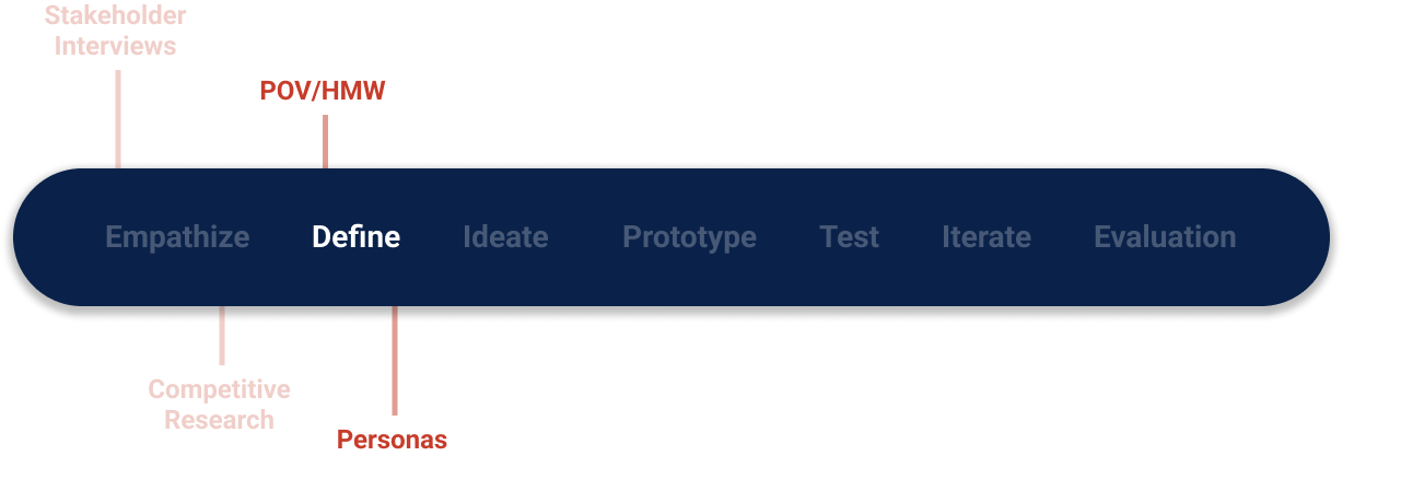
Define
What do the users need from this design? What problems can I solve for them?
Goal: Step into the users’ shoes. Minimize my own bias.
Here’s what I did to deepen my thinking:
POV Statements
HMW Questions
User Personas
Users need to see what USEI is about at-a-glance because people lose interest in the company in dense text and go back to google search results.
Users need to learn information about USEI so they know that they can fulfill their needs.
Users need easily digestible information because telecommunications Is a complicated field and not all users are subject matter experts.
Point of View Statements
How might we organize the content in a way that is digestible to all users so that experts and non-experts can find the information they need to understand what type of partnership USEI would bring to their organization?
How might we make a homepage that shows the user at-a-glance why they need USEI in order to relate the company to the user and encourage interaction?
How might we guide users through informative and actionable task flows so that they want to interact with USEI?
How Might We Questions:
POV statements and HMW questions help narrow down the scope of the project and focus on the issues that are most relevant to the users. This helps me empathize with the user and create personas.
Personas


My personas stay with me as visual reminders to keep the users and their different needs and goals in focus as I move into brainstorming design solutions.

How many different ideas can I come up with?
Goal: Explore as many solutions as possible.
Ideate
Here’s what I did to brainstorm:
Playing with Opposites
Brainstorm
Feature Set Prioritization
Site Map
Task Flows
Low Fidelity Wireframes
Mid Fidelity Wireframes
Playing with Opposites starts with ideas that we don’t like so that we can create solutions that the users will love.

Brainstorming shows our initial ideas for features, information architecture, and UX.

Sitemap provides a framework for user/task flows. We started by understanding the design’s current sitemap and iterating several times on a new one until it was simple, straightforward, and engaging.


Redesigned Sitemap

Task Flows provide a framework for which screens to wireframe. After several iterations, we settled on our two main flows around which we would center the design.

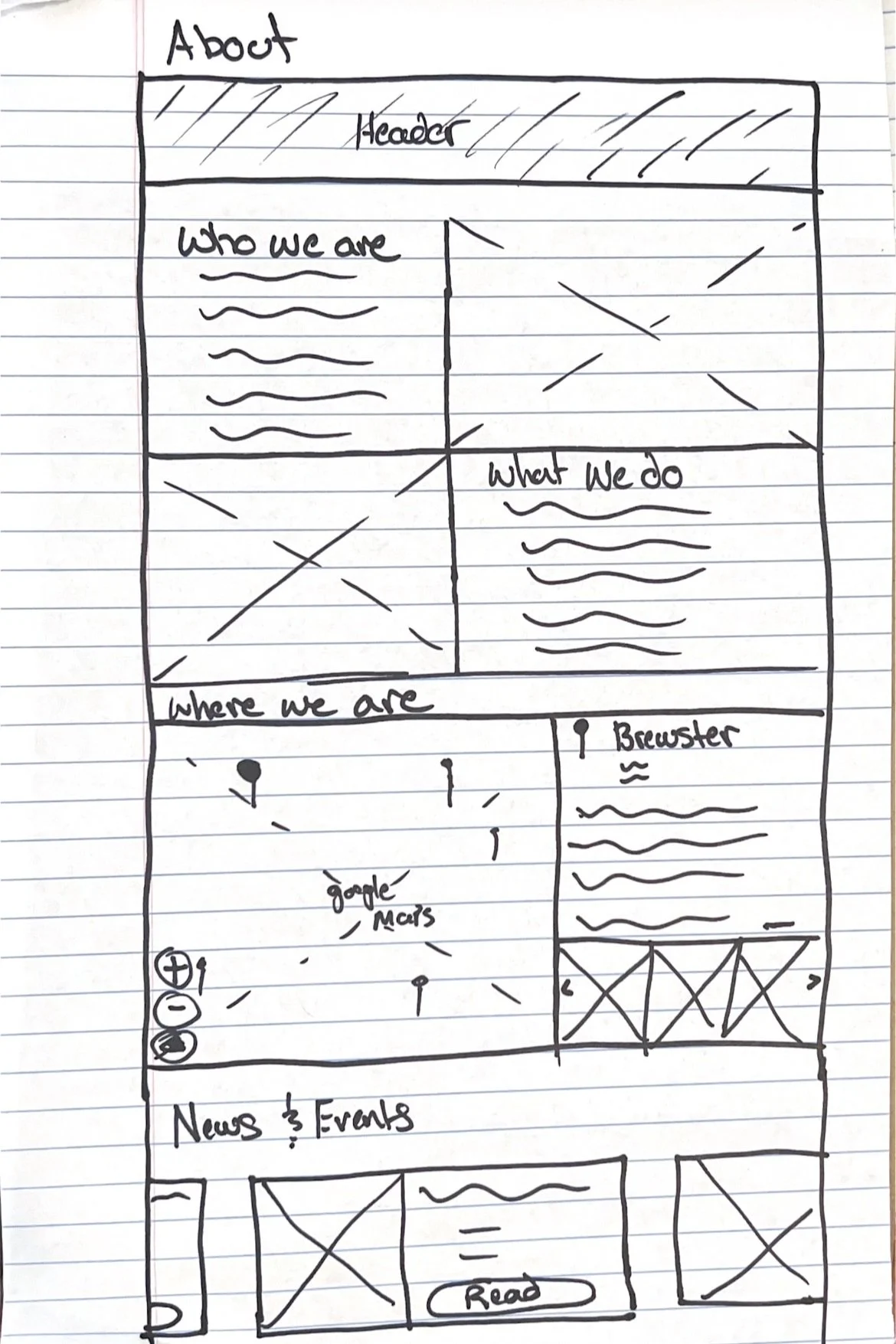
Low Fidelity Wireframes are a low-cost way to explore solutions and decide which designs to bring to high fidelity.


Mid Fidelity Wireframes give an idea of what the final product will look and function. To bring it to life, we need to add branding.


Innovation
Contact
Bio


Solutions
Home

About


Prototype
How does this all come together? What are the best design decisions for the users, the business, and the developers?
Goal: Create a MVP to test for usability.
Below is a screenshot of part of our Component Library. We use an atomic design system to keep our work pixel-perfect and to make site-wide iterations easy peasy.
Component Library also ensures that our design will remain alive even if we aren’t there to personally take care of it. We provide elements that can easily change and grow as the company does. This is one way in which we design with a focus on longevity.
Component Library

High Fidelity Screens


We linked our high fidelity screens together to create a working prototype to conduct accessibility testing.

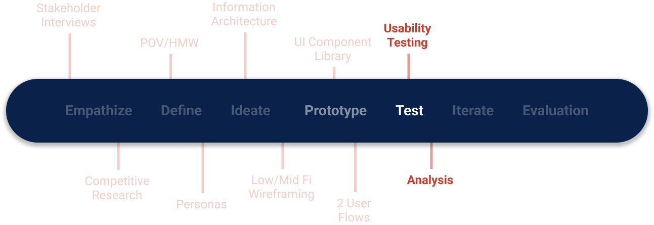
Test
What do the users think of the design? Does it make sense to other people?
Goal: Stay open to feedback and find out what needs to improve.
We had 4 participants click through our prototype to see what we could iterate upon. Participants successfully completed both tasks with few errors and gave overwhelmingly positive feedback. Expert users agreed that the design meets the company’s goals.
Results
4/4 participants successfully completed tasks provided.
“I love how easy it will be for users to contact and follow on LinkedIn. It’s always on the screen as an option.” - Adam
4/4 participants had few to no errors that affected their ability to complete tasks
“This site is really easy to navigate.” - Kye
4/4 participants gave overall positive feedback on the design’s visual appeal and enjoyability
“This looks really nice; the images look great. The only thing is you could make the design a little more playful.” - Nicholas
2/2 expert users think it meets the company’s goals/needs.
“I wouldn’t have known that this was designed by people who aren’t in the [telecommunications] field. It looks great.” - John
We organized the constructive feedback we received to help us visualize it and decide which iterations to make.
MoSCoW


Impact vs. Effort Matrix

How can I use my research findings to improve my design?
Goal: Create solutions for the issues that will be most useful.
Priority Revisions
Change background color from pure white to a light gray
Make the coverage map and solutions look more related
Make the design more playful

4. Change home page CTA from “contact” to “learn more”
5. On mobile, add more breathing room between sections and more padding within modules.


How did the solution address the problem?
Goal: Understand how the design meets the users’ and business’ needs.
The research expressed that our redesign of USEI’s website:
refreshes and modernizes the look and feel
conveys the professionalism and expertise of the company
We hope that our design is implemented and that it serves to help the business grow by attracting customers.
Backed by our research, this design simply and captivatingly presents USEI and their solutions in a way that is consistent with their mission and goals.
As a design team, Ian and I addressed design challenges separately at first then came together to solve it. We each created out own versions of solutions at every step then iterated together. This was my first project working with a design partner and with real stakeholders; I learned a lot about defending my design decisions without getting defensive and about how to communicate constantly about UX design. Literally constantly; we live and work in a 1 bedroom apartment.
Thank you for reading!
Interested in working together?

